

IBM Saas Console
- UI/UX Design
problem statement
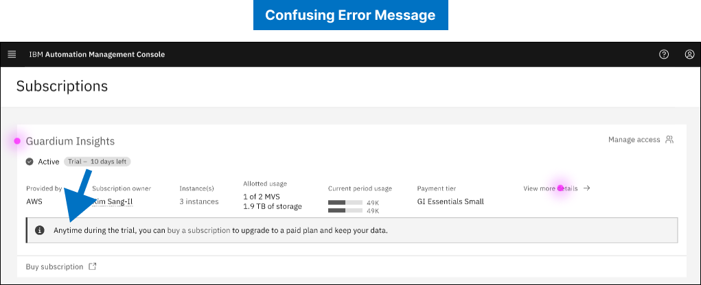
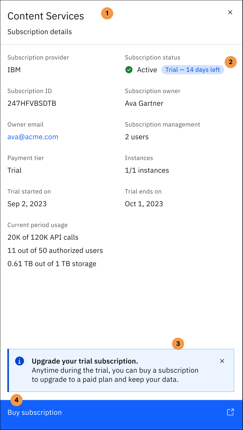
Error and warning alerts of the IBM SaaS console were not clearly visible to its users, causing confusion.

user feedback
- The ambiguous alert messages do not clearly indicate when the users' data will be lost.
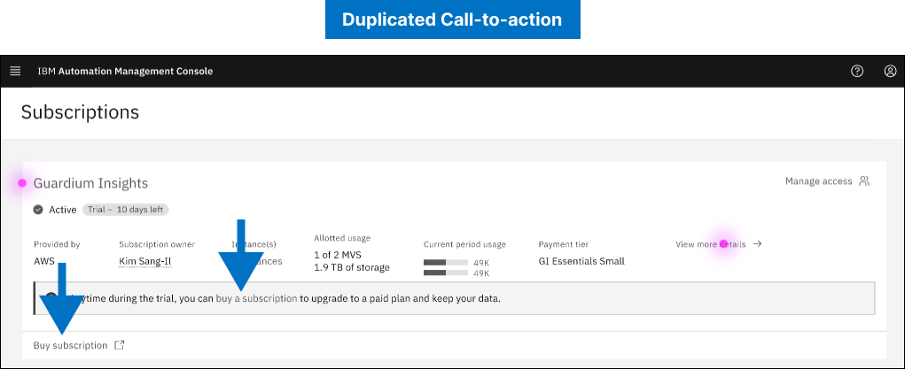
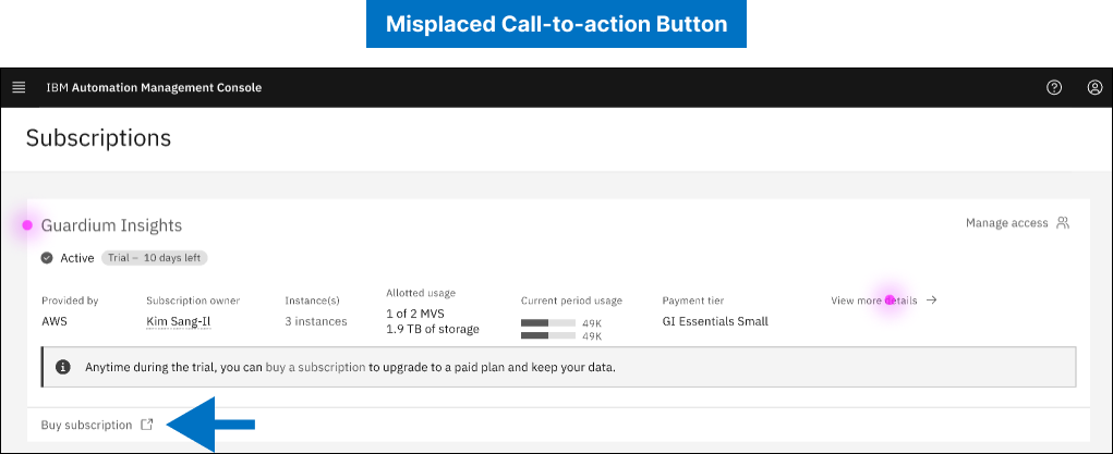
- The "Buy subscription" call-to-action is duplicated and placed separately from the rest of the content which can lead to confusion.
- Date:June 2023 - August 2024
- Role:UX/UI Designer
- Tools:Figma
- Team Members:IBM Design Team
solution
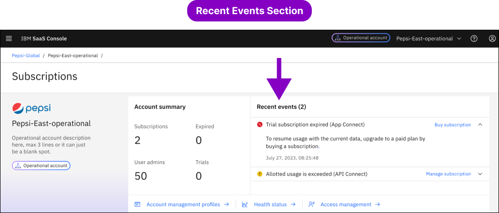
The solution was building a separate section at the top where users can quickly find recent alerts. This includes adding colored icons (red for expired subscription and yellow for usage exceeded), easier instructions, and clearer call to action buttons (Buy vs. Manage Subscription).
Another solution was a pop-up that includes more details about the service that allows for easier subscription renewals.
impact
Although not public yet, the changes will improve user understanding of errors, leading to less frustration
reflection
I learned that error messages should be easily and quickly accessible, as errors can be detrimental to the overall user experience.
Thank you for reading! 🚨